I have a deep, dark, shameful secret to admit—poster sessions at conferences make me cringe. There, I said it.
It’s not actually the sessions that bother me—I think they provide an opportunity to have one-on-conversations with colleagues and prospective collaborators, all while partaking in (hopefully free) booze and greasy snacks.
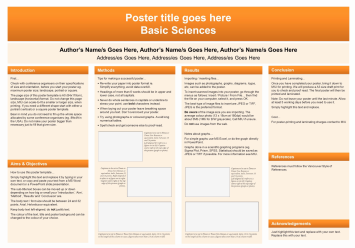
No, it’s the posters themselves that make my science communicator heart sad. When did it become the norm for posters to have infinitely small text, ridiculously jargony language, and obscenely dull visuals? Why isn’t anyone making use of the many at-your-fingertips editing and design apps to jazz up their posters these days? Who are those people taking time to actually read any of these wall-mounted journal articles? They must be angels.

“Look how much fun we’re having designing this conference poster!” said no grad student ever….until now.
I can count on one hand the number of times I’ve walked past a poster that grabbed my attention and reeled me in for a closer read, and one of those times was because the poster was about manatees—my all-time favorite ocean animal. But the other times were posters that used an eye-catching design, graphics, and images, and more importantly didn’t include superfluous text. Most other posters look like they’ve downloaded their template straight from the PowerPoint starter pack:
I think that all conference posters should be, nay deserve to be, eye-catching and creative. I don’t really blame the poster authors for the current state of blandness. Most of us are just following advice, templates, or examples from senior members of our field, assuming that a conference poster has to follow a specific set of poster-design commandments passed down through the ages. Poster sessions have become as standard as talks at scientific conferences, and the ‘poster presentation’ is a rite of passage for most graduate students.
But guess what? There are no poster commandments. And the budding young scientists rejoiced.
There are recommendations and guidelines for conference posters, but almost no conference committee requires that a poster be designed to look exactly like a scientific paper smooshed all onto one page. It’s true! Release the shackles. I looked up poster guidelines for several of the largest science conferences in my field, and not one of them prescribed a strict template. In fact, most stressed that less text and more visuals were preferred, and that posters should be used to spark conversation, not summarize your work in full detail.

Here are some scientists rejoicing in the knowledge that they never have to use PowerPoint Template #3 again to design a conference poster.
Here are three examples of poster guidelines I found on conference websites:
The American Geological Union (AGU) states, “Include the background of your research followed by results and conclusions. A successful poster presentation depends on how well you convey information to an interested audience.”
The International Marine Conservation Congress (IMCC): “Text should be limited to brief statements. Each poster should make a unified, coherent explanation of your work. Materials, both textual and visual, should be of professional quality and clearly legible from a distance.”
Ecological Society of America (ESA): The only specific poster guidelines listed on the ESA website are related to poster size dimensions.
So why aren’t more scientists breaking free from the standard PowerPoint three column poster template? It may be fear of breaking an unwritten norm and losing esteem in the eyes of their colleagues. Or it could be they just don’t realize that they have nearly a blank slate upon which to slather creativity and novelty. Either way, in the hopes of encouraging at least a few future poster presenters out there to consider changing it up, I’ve created a list of five things to avoid when making a conference poster, and what you can do instead. This isn’t an exhaustive list of pointers for designing a good poster—there are plenty of sites out there with that kind of information (like this, this, or this). My list is more about hacking away at the wretched habits of generations of boring posters, and moving into an era free from (okay, at least less dominated by) columns and boxes.
If you consider these four points the next time you are tempted to default to that icky PowerPoint template, your local science communicator will thank you, and may just give you a big grateful hug. And if you need help with a design, don’t be afraid to reach out to the #scicomm community!
Alright, without further ado, here are four conference poster no-no’s according to a scientist turned science communicator:
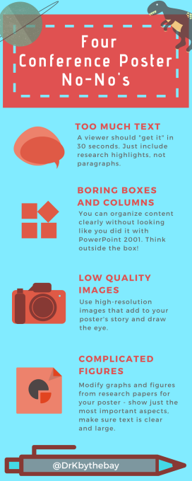
1. Text, text and more text.
Your poster doesn’t need to describe every detail about your research. That’s what the interaction at poster sessions is for—the talk with other people about your work. Focus on the broader context and importance of your research, rely more on visuals, and provide your contact info so interested folks can contact you if they want to know more. A viewer should “get it” in 30 seconds. You can provide in-depth information in a handout.
A good rule of thumb I’ve seen is that if you removed all the body text from your poster, your visuals should still be able to tell a story. If you’re really feeling bold, do away with paragraphs all together! Just use dot points and key phrases that people can easily follow. Also, try to keep 40% of the poster area empty of text and images. I would also love to see more posters with titles that I can understand without needing five PhDs (one is enough for me, thanks!). Simple language does not mean less scientifically sound.
Here’s some inspiration:
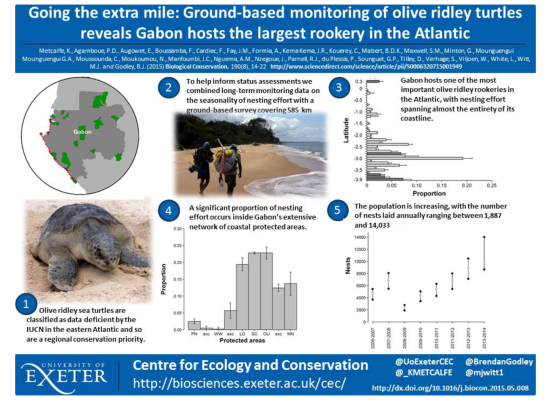
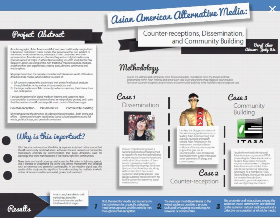
This poster uses key highlights and large visuals to tell a clear, engaging story without much text.
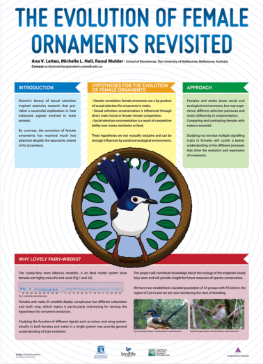
Brief text, large and interesting visuals, and contrasting colors really draw the eye to this poster.
2. Boring boxes in boring columns in boring colors.
While you don’t want your reader to be confused about how to follow the story you present on your poster, there is no law stating you have to use 3 columns with one box for each section and the standard Microsoft color scheme. There just isn’t. You can still organize your points from top to bottom and left to right, or by separating text using boxes in some cases, but you can do this and still make an interesting design. Think infographic instead of scientific poster.
Here are some examples:
You can take a slightly unconventional approach to poster design and still get your points across clearly with a little creativity.
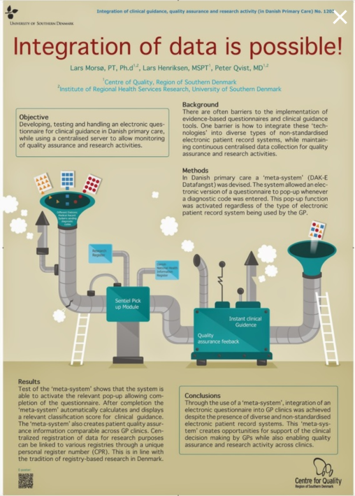
This poster takes a bit more of an infographic approach to explain their research activities.
3. Low quality images that look like pixelated blobs.
Okay, so you’ve thrown a bunch of images on your poster to take the place of the text, but you failed to consider whether they were high enough resolution, or whether anyone would be able to tell that that pixelated bunch of brown cells is actually a soil sample under a microscope. Instead, make sure to use high quality images (check the file size and resolution), crop as necessary to focus on key parts of the image, and try to use photos that have contrasting colors or clear features that enhance your research story. Do you study wombats or pitcher plants or tardigrades? Use several awesome photos of them on your poster! Even if you study something less glamorous or more abstract, use drawings, cartoons, or photos of the habitat/region you study that draw attention to your topic, like this poster:
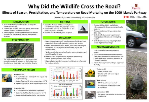
This poster uses a fairly standard layout, but with minimal text (yay dot points!), and lots of helpful visuals that enhance the research story. Evidence that you don’t have to go full rogue to make a better poster.
4. Complicated figures that make people run away scared.
Similar to using bad images, bad figures negate the point of using visuals in your poster. I know it takes added time and effort, but I beg of you to simplify graphs, charts, or other figures so that they are easily interpreted in under 10 seconds. Again, you want people to ask you questions. While you’re at it, make sure they are high enough resolution to read clearly at full size. Don’t just plop a big graph on your poster to take up space and reduce your need to come up with descriptive text. Instead, highlight just the most important or interesting outcomes of your research, and leave your readers wanting more.
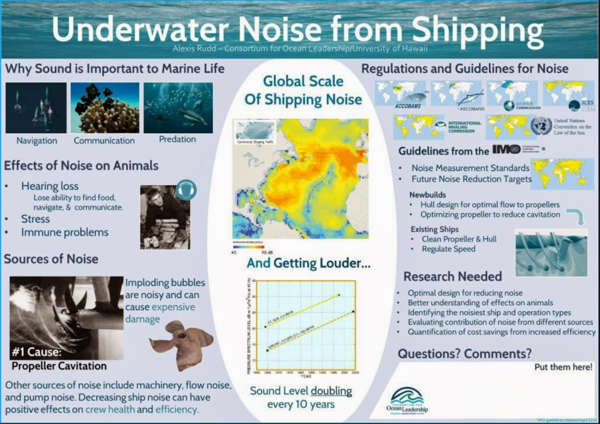
This was a poster featured on betterposters.blogspot.com, and while they gave some advice on how to improve some of the layout choices, the author did a good job of keeping things simple, putting the results up front and center with simple visuals, and even making a question box for people to leave comments.
Do you have other suggestions or thoughts about conference poster design and presentation? Leave them in the comments below!
BTW, here’s an Infographic version with the 4 poster No-No’s for those who want a way less wordy version!